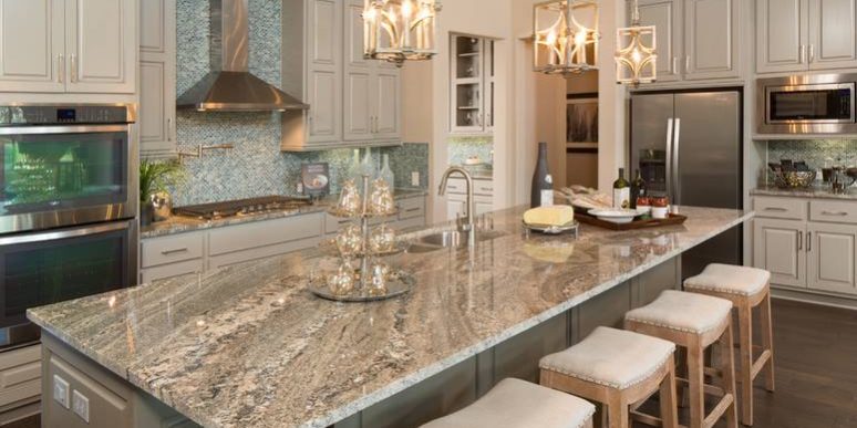
Whether it’s cooking, socializing, or design trends, kitchens are where the action is. Two-tone cabinetry, where some of the cabinets are finished in a different colour or material, is showing up all over the place—and with good reason. It’s versatile and stylish, and, because you needn’t cover all surfaces in the same material, can have unexpected cost benefits. The best two-tone designs work with other main features, like countertops or islands, and with hardware or fixtures. Read on for two-tone tips you can bring to your own kitchen.
Identify a focal point
As with any design, it’s important to consider flow, style, and focus. All these aspects will have some impact on how a person feels in the space. Two-tone kitchens are naturally visually interesting, but it’s important to have a focal point to the room—typically, the island or countertop.
Your kitchen design will flow from the focal point. This means that you might pick up colours or textures to echo throughout the room. For example, say you have a kitchen island with a veined granite top in shades of grey and white. As your focal point, this piece may help you select the colours (grey and white) to use throughout the room, as paint or in fixtures or hardware.
Colour and texture choice
When it comes to colour and texture, there are certain guidelines you can follow to get the effect you want.
One way to ensure a cohesive design is to sample colours directly from your focus piece. The consistency will create a calm and cozy atmosphere while highlighting your favourite elements. Keep in mind that if your countertop or island is dark in colour, you may want to keep the cabinets lighter to avoid overwhelming the space. If your focal point has a pattern, elements on the perimeter should remain simple.
If using two different colours is too busy, a similar sophisticated look can be achieved by using different textures or materials in the same colour. For example, upper cabinets could be painted a glossy white while the lower cabinets might be matte. The difference, though subtle, is enough to add that extra element.
In general, earthy tones add flow to a room, particularly if your focal piece is made of a natural material like wood or stone. Colours in the green and brown palette can be soothing and comfortable; include natural textures for a modern yet approachable space.
Colour placement
With two-toned cabinetry, it is important to consider where, as well as what. Perhaps the most typical arrangement is to put darker colours nearer the bottom of the room with lighter colours at the top. This helps create a fresh, open space that’s visually grounded. However, if you have a room with few upper cupboards and with a window or other light source shoulder height or higher, you can flip the design and place the lighter colour below.
The strategic use of white is also important. If your cabinets are multi-coloured, separate the colours with white to maintain visual balance. If you want white to be your primary colour, consider using two white tones, or a white in different textures or materials.
Two-tone countertops?
Why should cabinets have all the fun? The two-tone look can be applied to countertops and islands as well as cupboards (though, with few exceptions, you should choose one or the other).
For two-tone countertops to work, you’ll want to have a space with two separate counter areas such as an island and a perimeter top. In general, it makes sense to put your busier or showier piece on the island—literally in the centre or the room—with a more modest selection for the perimeter.
With their many areas and surfaces, kitchens are ideal for a two-tone design. Extraordinary surfaces serve as a visual anchor and focal point for the room, while a subtle—or not-so subtle—secondary colour or texture adds sophistication, visual appeal, and style. With a bit of planning and savvy, you too can hop on the hottest trend in kitchens.


